Quite a bit more has happened since my last post, and I was lamenting to my Facebook friends how I haven't been keeping up with my blog. It's time consuming, but I really enjoy posting. So I headed over here to take care of some business!
I'll limit this post to the story surrounding this drawing of Ronin, a handsome and impressive K9 with the Sacramento County Sheriff's Department K9 Division.
I had wanted to create a drawing of a working K9 for quite some time and the ball started rolling at the
2014 Kaleo Fun Run, a fundraising event. K9 Ronin was there with his handler for a meet & greet with the public. I was able to take some great photos of Ronin, and this one became the reference for the drawing. It was exactly what I had in mind.
I'll post some of the in-progress images here, but there are more that you can see in this
Facebook album, along with explanations of the various steps. My concept for this drawing was to add color to Ronin only. Because I knew I could get the dog right in this drawing (since animals are my subjects of choice), I worked on the car first. I didn't want to put all the work into the dog and then not have the car & concept work out the way I wanted. When I was happy with the way the car turned out, I went to work on Ronin. The only "color" on the car is where I took a grey art marker to knock back the lines at the edges of the car and the lettering on the door panel. I used my go-to #16 X-Acto blade for everything except in a few places (the STAY AWAY lettering and a few other parts of the car), where I used a tattoo needle to knock things back a bit.
 The "all scratched" stage, ready for color on Ronin
 This is a detail of the section under the dog's feet. That area took a long time to do. It's a process of scratching, re-inking with stipples & scribbles, re-scratching, re-stippling, etc., until I achieve the smooth transition that I want. A section of fur that size would take less time to do. There's not much need for re-working, if I get the fur right on the first pass, with some refining, that's it!
For a "zoomable" version of the finished drawing,
click here.
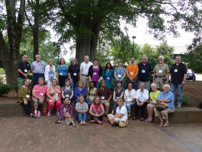
When the drawing was finished, I contacted Ronin's handler to give him a print. I found out he had been promoted and Ronin has a new handler, so the two of them worked things out so I could meet them, Ronin, and nearly the entire K9 Division. It was a great experience and an honor. Ronin's former handler was presented with a shadowbox commemorating his time with the division and I presented him with the print of the drawing. It was a fantastic way to spend a few hours, and they brought out many of the dogs for me to photograph. You can see some of those photos in this
Facebook album.
 Me with Sergeant Gregory, Ronin's former handler
 Me with Ronin
And finally, I sent this drawing to the
International Society of Scratchboard Artists' 4th Annual Juried Exhibition in Frederick, MD in July and am thrilled to announce that it received an Award of Excellence in the Open division. It didn't sell there, so it's back here in my studio where it will be on display for our annual
Newcastle Art Studios Tour in October.
Read more...